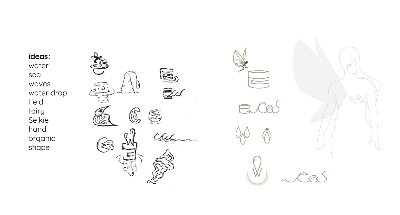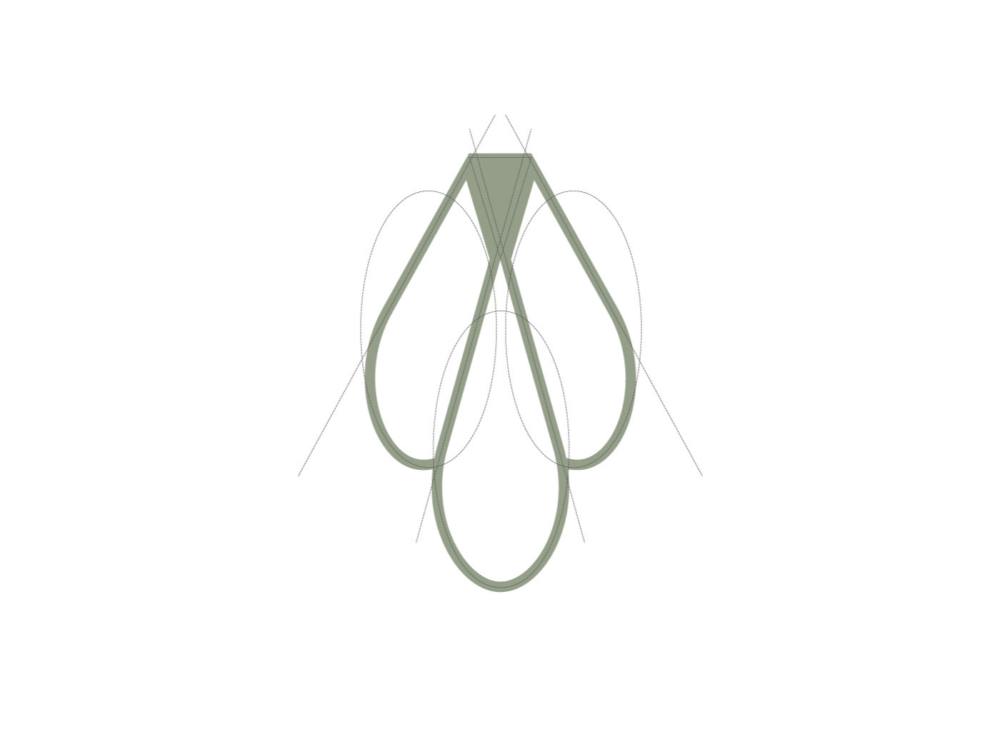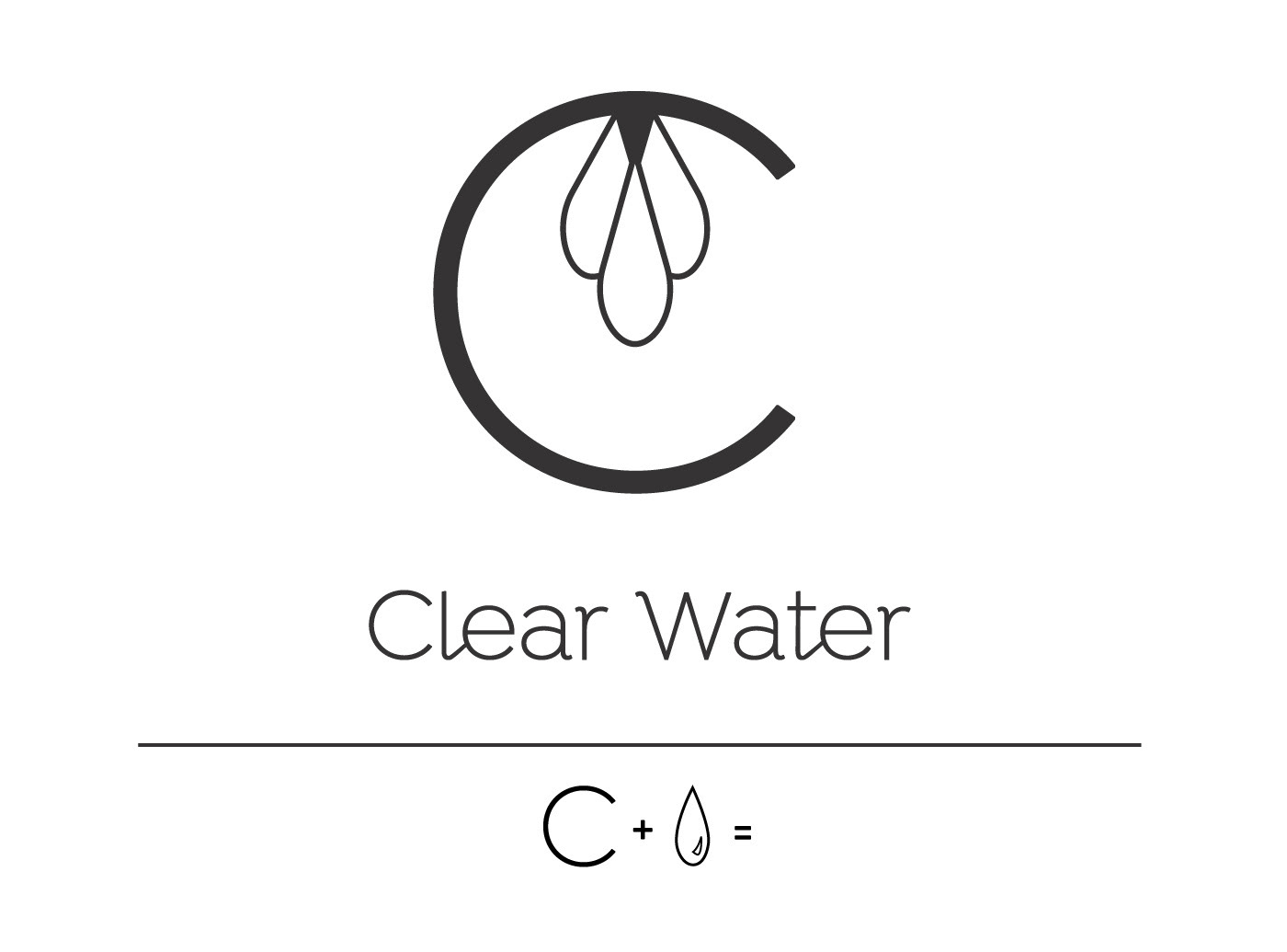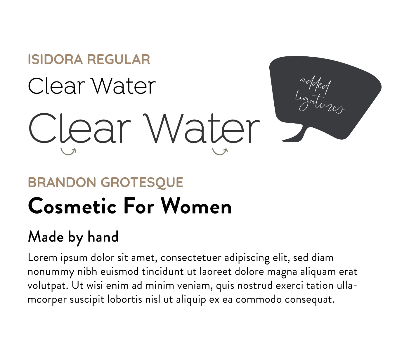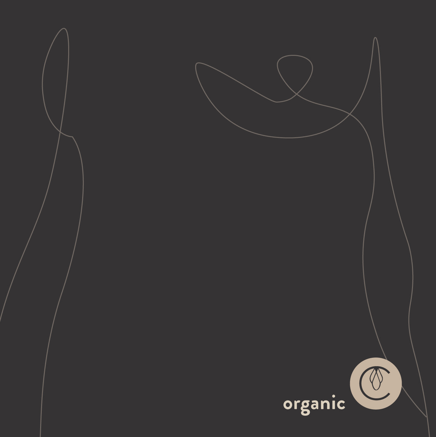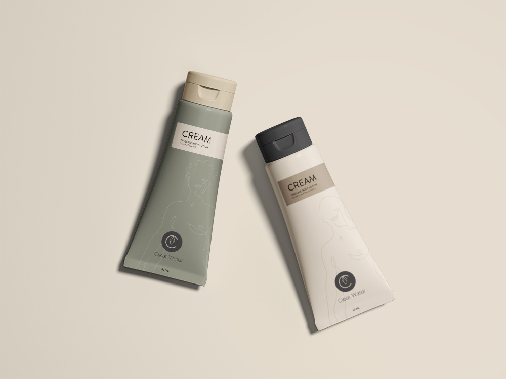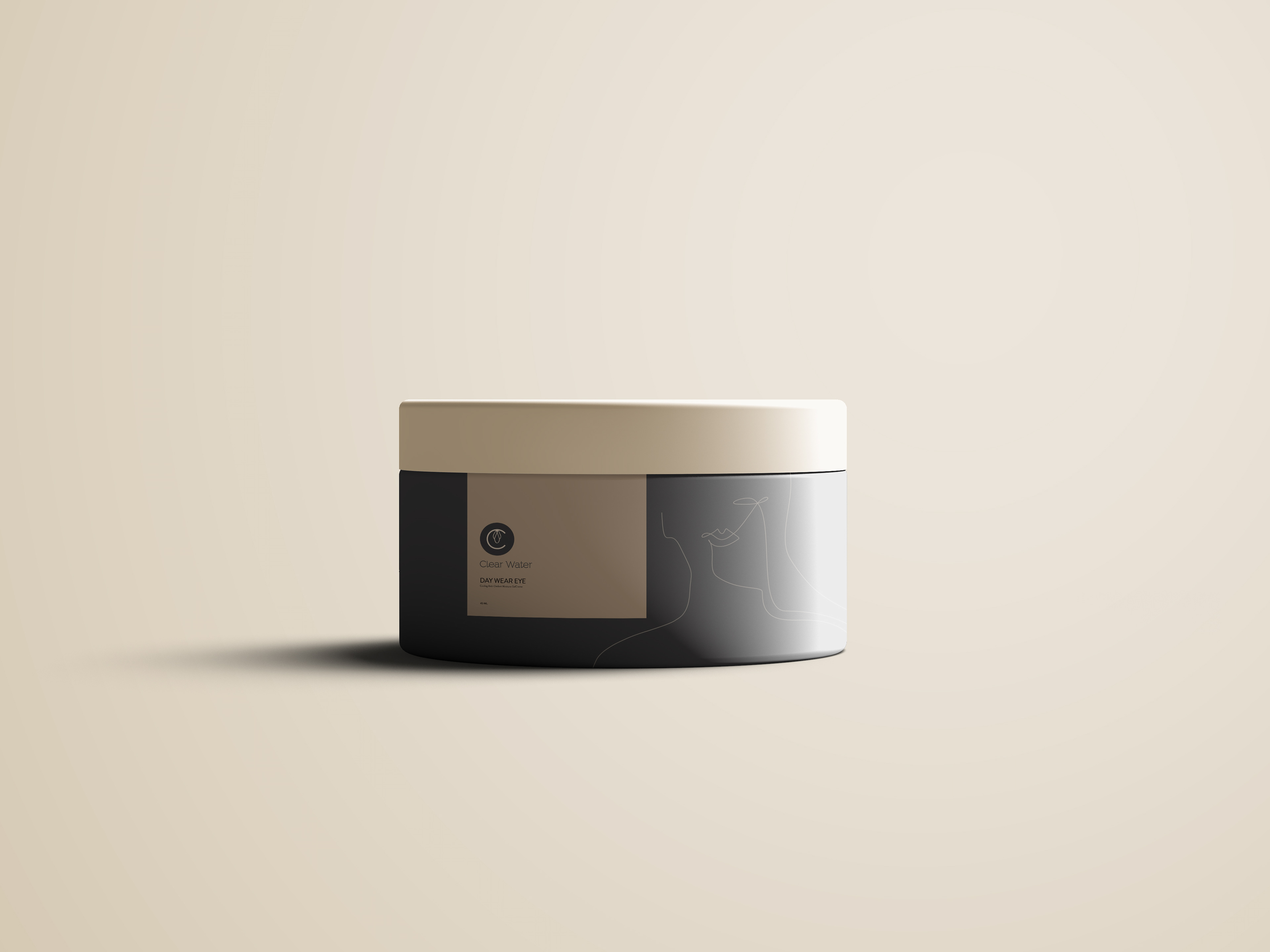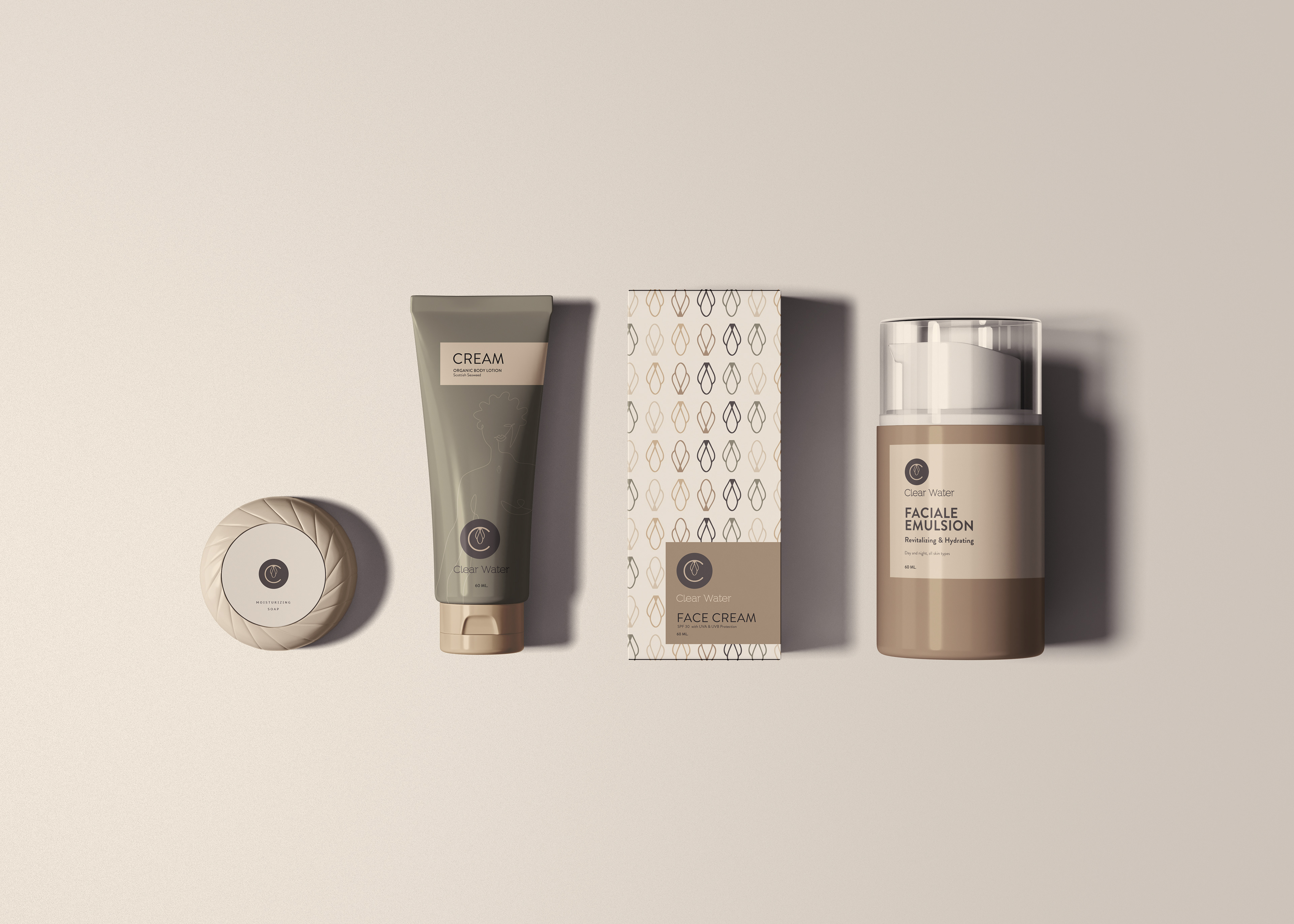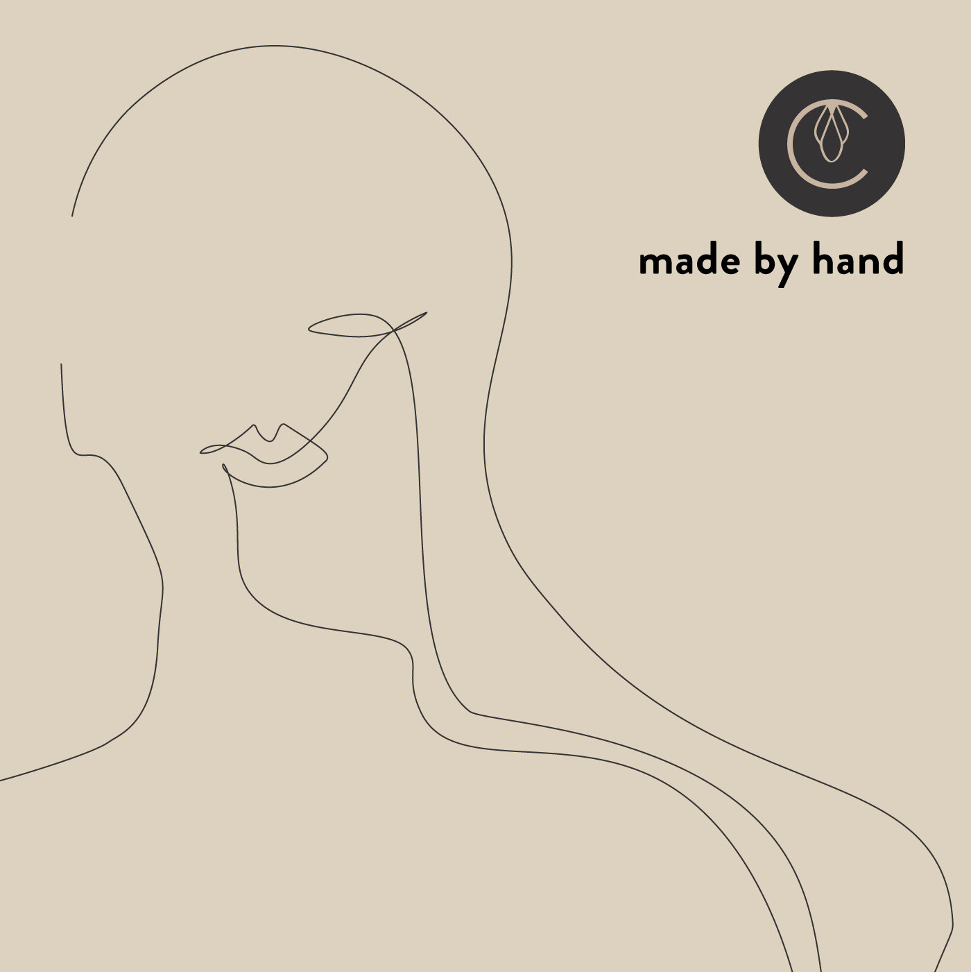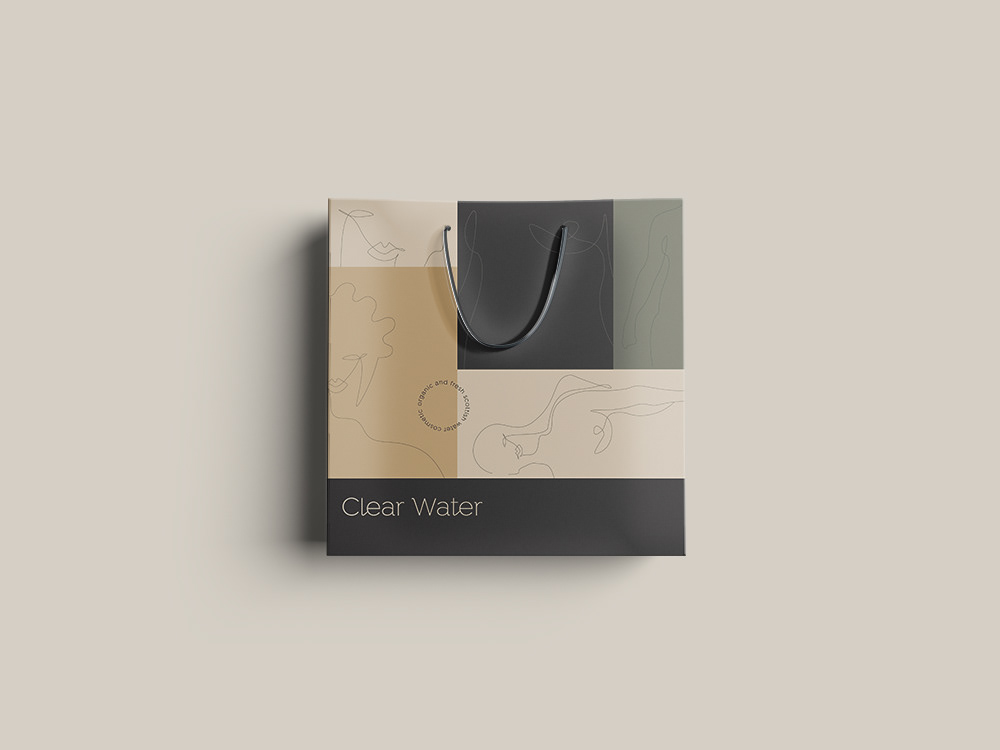
Clear water, a Cosmetic company, was looking to design a new logo. (fictif project) This Scottish company caters to women between the age of 22-40 years old. It positions itself toward the higher end of the market. Water being an important part in the making of the products, it is also organic and made it limited batches by a small team. With the name Clear Water and it’s location, one could think of the sea, waves, water, green fields, ponds, and organic shapes. As for me, I decided to explore the Folklore of the land, the water mythologie that includes fairies and Selkies. I was looking for a link between water and women since this water element is so predominante in its making. I found that Ashrays fairies are completely translucent water creatures that are often mistaken for sea ghosts. When captured and exposed to sunlight, ashrays supposedly melt and only a puddle of water remains. As for Selkies, legend has it that in order to come ashore, selkies (seal folk) must first shed their skin. And from there, came the idea of having the letter “C” become a “body of water” that would capture water drops that Fairies would have left on land and have just the outline of women since “Fairies are Translucent and that the Selkies shed their skin. I thought it would give a nod to the product as women use it to obtain their best skin! As for the font, I decided to use Isidora since it’s contemporary and has nice curves to remind us of woman. I added ligatures with the letter E, thus, giving the words a little personality and flair.
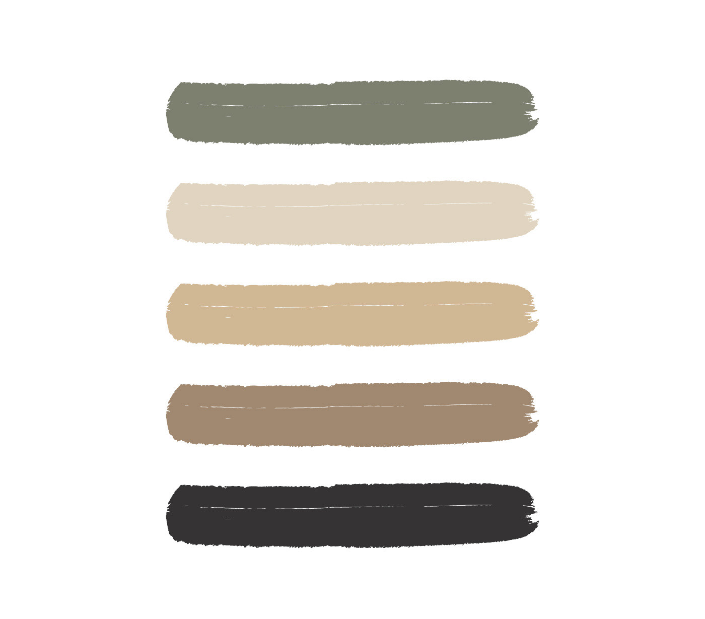
concept / layout / color palette / Typo