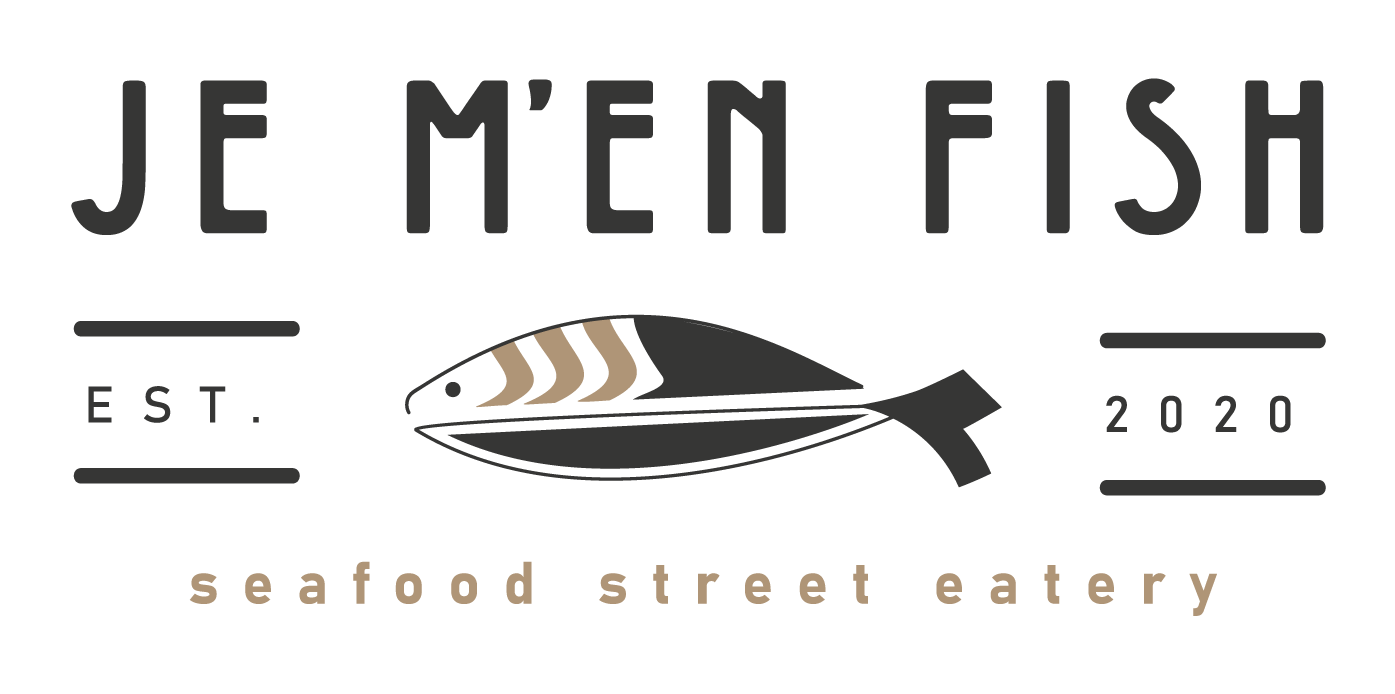
Je m'en fish (a play on word) in English means "I don't care"... and this stubborn little one sure goes wherever it wants, possibly discovering new places. He's a globetrotter, an explorer, a pioneer.
Let's dive into its story.
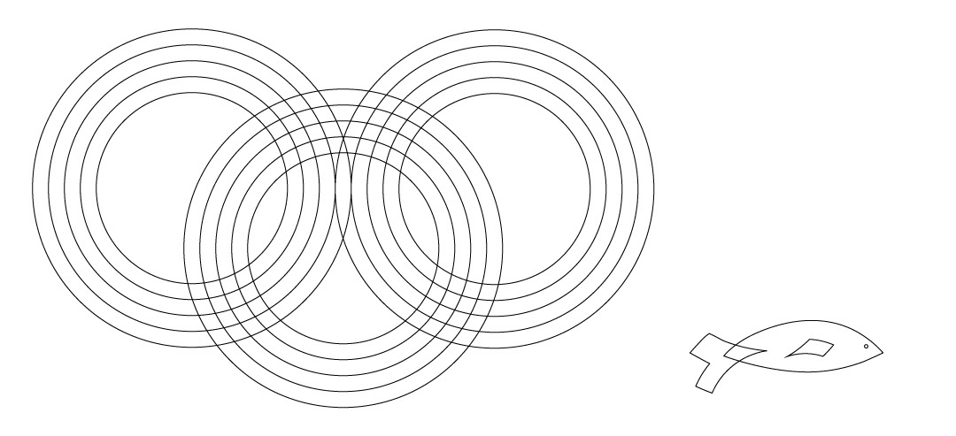
So, how did this conception come to be? From a Behance tutorial using geometric shapes to create minimalist logos. So this little one happened first...
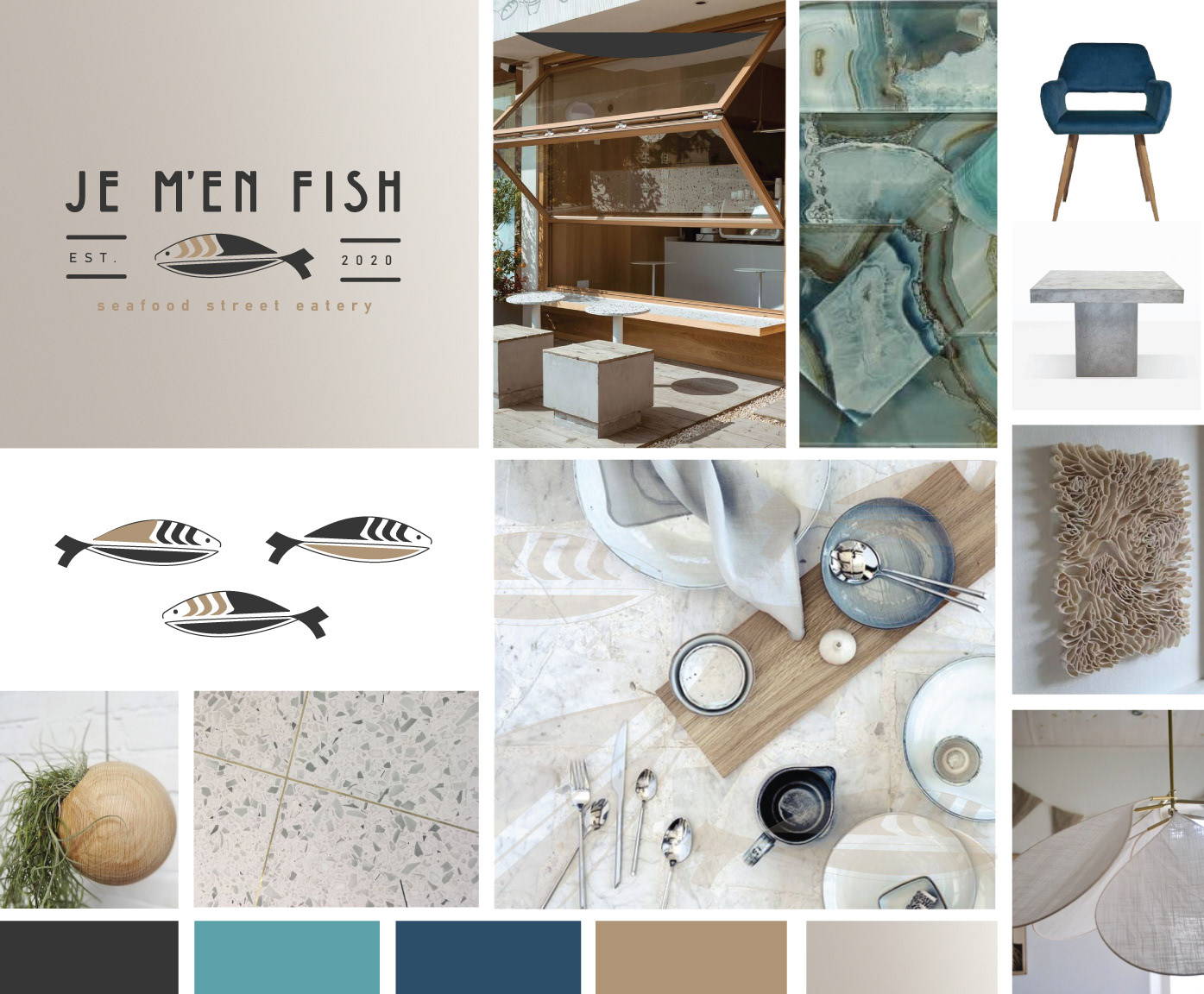
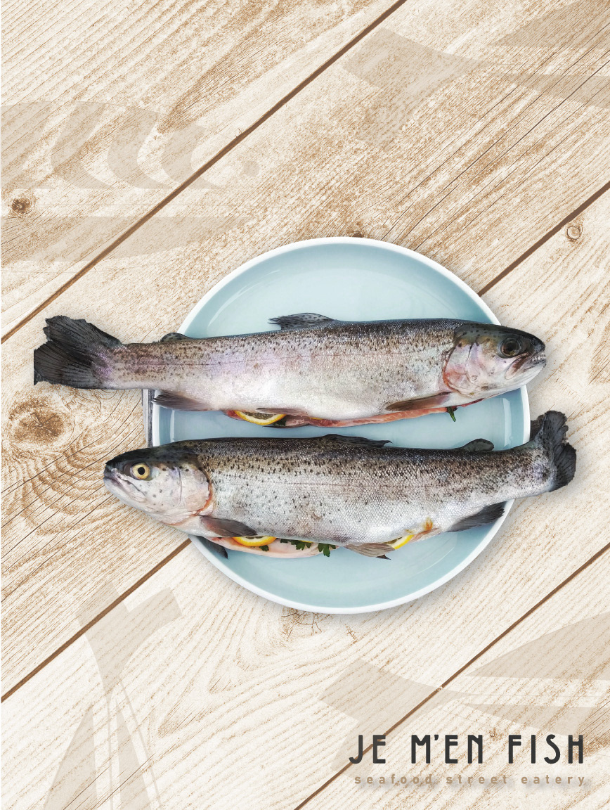
Since I'm a big fan of interior design, I wanted my inspiration to come from a Pinterest moodboard I created where I had selected the look and feel of a "makeshift" Seafood Restaurant. I then, let the colors and vibe inspire the "modification" of the icon.
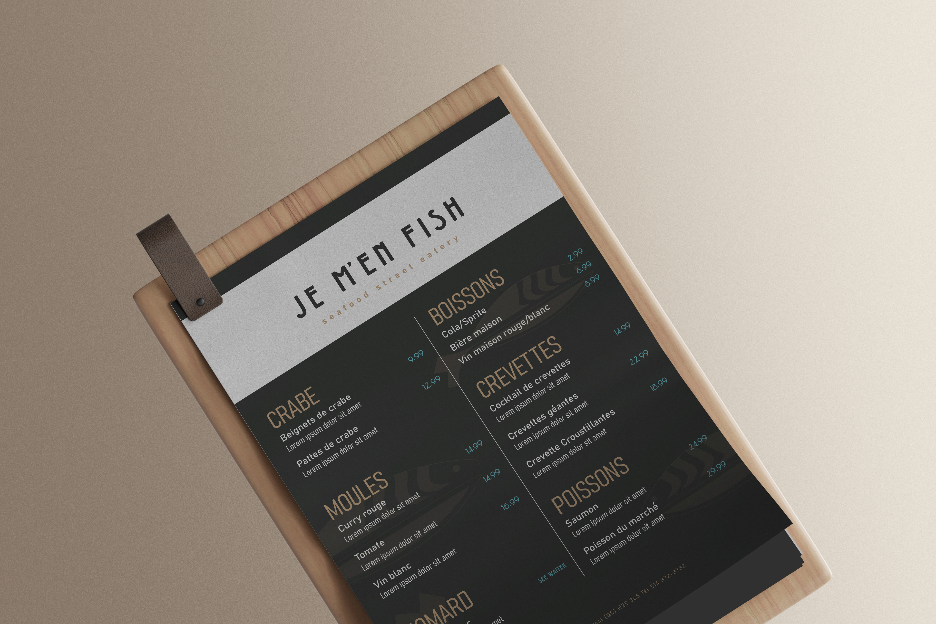
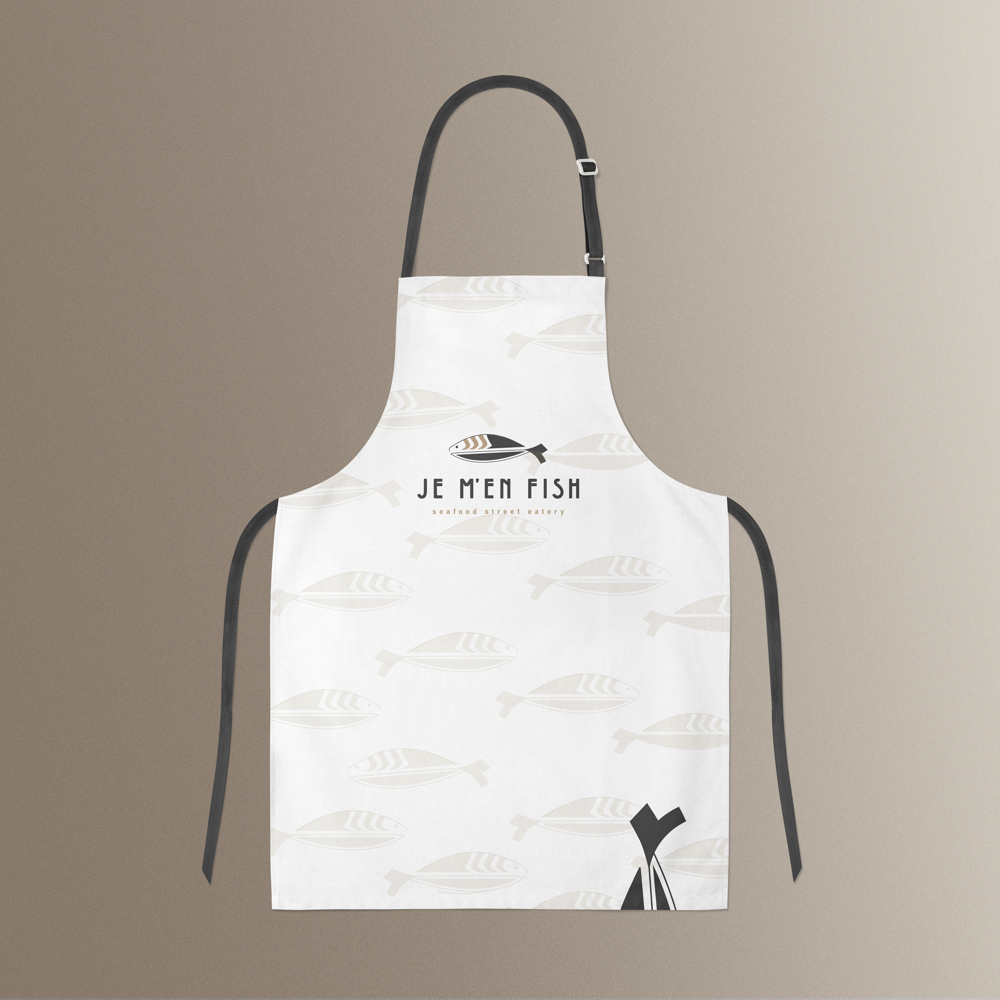
It seems I always go to gold... This time it was ideal for this Seafood Street Eatery that wanted to convey themselves as the best high standard for its food quality. As for the font, I wanted something elegant, modern, and a little retro to tie it all up.
Moodboard / Inspiration